The Role of Color Psychology in Flyer Marketing

Color plays a significant role in marketing and branding, influencing consumer emotions, behaviors, and perceptions. In flyer marketing, the strategic use of colors can enhance engagement, attract attention, and drive desired actions. Understanding color psychology can help businesses design more effective flyers that resonate with their target audience. This guide explores how different colors impact flyer marketing and how to use them effectively.
1. Why Color Matters in Flyer Marketing
Color is one of the first things people notice in marketing materials. It can evoke emotions, convey messages, and make content more visually appealing.
Key reasons why color is important in flyers:
- Grabs Attention: Bold colors make flyers stand out in a crowded space.
- Influences Emotions: Colors can evoke feelings of excitement, trust, urgency, or relaxation.
- Enhances Readability: Proper contrast between text and background improves readability.
- Strengthens Branding: Consistent color use reinforces brand identity.
2. Understanding Color Psychology
Each color has psychological associations that can influence how people perceive a flyer. Here’s a breakdown of commonly used colors and their effects:
Red: Excitement & Urgency
Red is associated with passion, energy, and urgency. It is commonly used in:
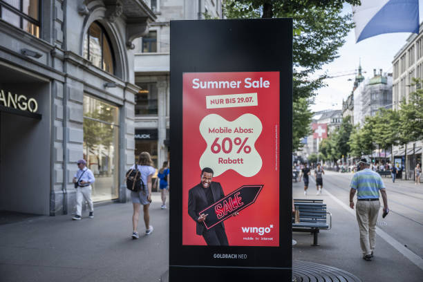
- Sale Promotions: “Limited Time Offer!”
- Restaurants & Food Services: Encourages appetite and action.
- Call-to-Action Buttons: Draws immediate attention.
Blue: Trust & Professionalism
Blue conveys trust, stability, and reliability. It works well for:
- Corporate Flyers: Used by financial and healthcare industries.
- Tech & IT Services: Creates a sense of security.
- Consulting & Law Firms: Reinforces professionalism.
Yellow: Optimism & Attention
Yellow is cheerful and grabs attention, making it effective for:
- Event Flyers: Promotes excitement and fun.
- Retail & Promotions: Draws interest in discounts and special offers.
- Children’s Services: Friendly and inviting.
Green: Health & Sustainability
Green represents nature, health, and balance, ideal for:
- Eco-Friendly Brands: Organic, sustainable, or environmental causes.
- Health & Wellness Services: Spas, yoga studios, and health products.
- Financial Services: Symbolizes wealth and growth.
Orange: Energy & Enthusiasm
Orange is warm, friendly, and energetic, making it useful for:
- Sports & Fitness Flyers: Promotes high energy.
- Limited-Time Offers: Encourages urgency without being aggressive.
- Community Events: Creates an inviting and fun feel.
Purple: Luxury & Creativity
Purple is often associated with sophistication, creativity, and exclusivity. It works well for:
- Beauty & Fashion Flyers: Promotes elegance.
- Luxury Services: High-end brands and exclusive promotions.
- Creative Industries: Art, music, and design-related businesses.
Black: Elegance & Authority
Black is sleek, modern, and authoritative, commonly used in:
- Luxury Branding: High-end products and services.
- Corporate & Business Flyers: Professional and formal appeal.
- Minimalist Designs: Keeps focus on key information.
White: Simplicity & Cleanliness
White provides a sense of cleanliness and simplicity, best used for:
- Medical & Healthcare Flyers: Represents purity and professionalism.
- Technology & Modern Brands: Minimalist and futuristic appeal.
- Contrast & Readability: Ensures easy-to-read text against colored backgrounds.
3. Best Practices for Color Use in Flyer Design
To make the most of color psychology, follow these best practices:
- Use Contrasting Colors: Ensure readability by pairing light text with dark backgrounds and vice versa.
- Limit Color Choices: Stick to 2-3 main colors to maintain a cohesive look.
- Align with Branding: Use colors that reflect your brand identity.
- Guide Attention: Use bold colors to highlight key messages and call-to-action areas.
- Test Color Combinations: Ensure colors complement each other and don’t clash.
4. Choosing the Right Color Scheme for Your Flyer
The choice of colors should align with the flyer’s purpose and audience. Here are a few effective color combinations:
- Red & Yellow: Great for promotions and fast food flyers.
- Blue & White: Ideal for corporate and healthcare flyers.
- Green & Brown: Perfect for eco-friendly or organic brands.
- Purple & Gold: Creates a luxurious feel for high-end services.
- Black & Red: Adds sophistication and urgency to fashion or entertainment flyers.
5. Testing and Measuring Color Effectiveness
Before finalizing your flyer design, test different color variations to see which resonates most with your audience.
Ways to measure effectiveness:
- A/B Testing: Print two versions with different color schemes and compare response rates.
- Customer Feedback: Ask customers which flyer design they find most appealing.
- Online Polls: Use social media to get opinions on flyer color preferences.
Conclusion
Color psychology plays a crucial role in flyer marketing, influencing customer perception and engagement. By strategically selecting colors that align with your brand and message, you can create visually compelling flyers that capture attention and drive action. Whether promoting a sale, launching a new product, or increasing brand awareness, using the right colors can significantly enhance the impact of your flyer campaign. Apply these color principles to your next flyer design and watch your marketing efforts succeed!
Frequently Asked Questions
Browse answers to common questions about our services.


