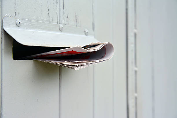
How to Create a Minimalist Flyer That Stands Out
Home /
Blog / How to Create a Minimalist Flyer That Stands Out
In a world inundated with information and advertisements, minimalist design has become a breath of fresh air. A minimalist flyer is not only visually appealing but also highly effective in delivering a clear message. By focusing on simplicity and functionality, you can create a flyer that stands out without overwhelming your audience. This guide will show you how to create a minimalist flyer that makes an impact.
1. The Philosophy Behind Minimalist Design
Minimalist design is all about “less is more.” It emphasizes simplicity, clarity, and the intentional use of space. In flyer design, this means eliminating unnecessary elements and focusing on the essentials, your message, your visuals, and your call-to-action (CTA). A minimalist flyer should communicate its purpose at a glance, making it easier for your audience to engage with the content.
2. Start with a Clear Purpose
Before you begin designing your flyer, define its purpose. Are you promoting an event, a product, or a service? Understanding the goal of your flyer will help you determine which elements are essential and which can be omitted. For example, a flyer promoting an upcoming sale might only need a bold headline, a few key details, and a simple CTA like “Shop Now.”
Having a clear purpose ensures that every design element serves a function, keeping the flyer focused and effective.
3. Use White Space Effectively
White space, also known as negative space, is a hallmark of minimalist design. It refers to the empty areas around your text and images. Far from being wasted space, white space helps draw attention to your content and makes the flyer easier to read.
Here’s how to use white space effectively:
- Avoid Clutter: Limit the number of elements on your flyer to create a clean, open layout.
- Guide the Eye: Use white space to create a natural flow that guides the reader’s eye from one section to the next.
- Prioritize Legibility: Ensure there’s enough space between text blocks to make the flyer easy to read at a glance.
4. Stick to a Limited Color Palette
A minimalist flyer doesn’t need a rainbow of colors to be effective. In fact, using too many colors can make the design look chaotic and unprofessional. Instead, stick to a limited color palette, ideally, one or two main colors with neutral tones to balance the design.
For example:
- Use a single bold color for your headline or CTA to make it stand out.
- Combine shades of gray or white for backgrounds and secondary text to create contrast without overwhelming the design.
- Consider the psychology of colors. For instance, blue conveys trust, red evokes urgency, and green symbolizes growth or eco-friendliness.
5. Choose Clean and Modern Typography
Typography plays a critical role in minimalist design. Your choice of fonts can set the tone for your flyer and influence how your message is perceived. Here are some tips for selecting the right typography:
- Use Sans-Serif Fonts: Sans-serif fonts like Helvetica, Arial, and Futura are clean and modern, making them ideal for minimalist designs.
- Limit Font Choices: Stick to one or two fonts to maintain consistency. For example, use one font for the headline and another for the body text.
- Focus on Readability: Avoid overly decorative fonts that can be difficult to read. Keep font sizes large enough to ensure legibility from a distance.
6. Simplify Your Message
The key to a successful minimalist flyer is a clear and concise message. Avoid long paragraphs and focus on the most important information your audience needs to know. Break your content into digestible sections, such as:
- Headline: A bold statement or question that grabs attention.
- Subheading: A brief explanation or value proposition.
- CTA: A simple instruction like “Call Now, ” “Visit Us, ” or “Learn More.”
For example, if you’re promoting a fitness class, your flyer might say:
Headline: “Get Fit Today!”
Subheading: “Join our beginner-friendly classes and transform your health.”
CTA: “Sign Up at www.fitnessclub.com.”
7. Use High-Quality Visuals
While minimalist flyers prioritize simplicity, visuals are still an important element. High-quality images or illustrations can add visual interest and reinforce your message. Here are some tips for using visuals in minimalist flyers:
- Stick to One Focal Image: Choose a single, high-quality image that represents your message. For example, a flyer for a travel agency might feature a stunning landscape photo.
- Use Icons Sparingly: Simple icons can replace text for commonly understood concepts, such as a phone icon next to a contact number.
- Maintain Consistency: Ensure your visuals align with your color palette and overall design aesthetic.
8. Optimize for Print and Digital Formats
Your minimalist flyer should be versatile enough to work in both print and digital formats. Keep the following considerations in mind:
- High Resolution: Use high-resolution images and graphics to ensure your flyer looks sharp when printed or viewed online.
- Readable Layout: Ensure text remains legible, even on smaller screens or when printed at different sizes.
- Include Scannable Elements: Add QR codes or short URLs to make it easy for readers to take action digitally.
9. Test and Iterate
Once your flyer is designed, test it with a sample audience to gather feedback. Ask questions like:
- Does the message come across clearly?
- Is the design visually appealing?
- Does the flyer prompt action?
Use this feedback to make adjustments and create the most effective version of your flyer.
Conclusion
Creating a minimalist flyer is about focusing on the essentials while eliminating distractions. By emphasizing white space, using a limited color palette, and keeping your message concise, you can design a flyer that not only stands out but also effectively communicates your message. Whether promoting an event, product, or service, minimalist design is a timeless and impactful approach. Start creating your standout minimalist flyer today!
Frequently Asked Questions
Browse answers to common questions about our services.
Seasonal promotions perform well with flyer marketing because they allow businesses to quickly promote limited-time offers, holiday events, seasonal services, and special campaigns to nearby customers.
Categories & Tags
Yes, coupon flyers are effective for restaurants, retail stores, salons, gyms, and service businesses because they combine local visibility with a clear incentive for response.
Categories & Tags
Seasonal flyer promotions allow businesses to advertise timely offers related to holidays, back-to-school campaigns, summer services, spring specials, and year-end sales.
Categories & Tags
Coupon flyer distribution places promotional offers directly into the hands of local consumers and can help drive immediate action, store visits, redemptions, and trial purchases.
Categories & Tags
Is flyer marketing effective for restaurant coupons and specials?
Yes, restaurant flyer marketing is effective for coupon campaigns because it places promotional offers directly into nearby homes, apartments, and local foot-traffic areas.
Categories & Tags
Can flyers help promote discounts and special offers?
Yes, flyer marketing is effective for promotional discounts because it combines local targeting with a visible call to action that can drive responses from nearby customers.
Categories & Tags
Are flyers effective for grand opening promotions?
Grand opening flyer campaigns are effective because they help businesses create excitement, promote limited-time offers, and increase attendance from nearby residents and local shoppers.
Categories & Tags
Can retail stores use coupon flyers and seasonal campaigns?
Retail stores can use coupon and seasonal flyer campaigns to attract local shoppers, increase store traffic, promote clearance sales, and highlight new or featured products.
Categories & Tags
More FAQs