How can flyers attract attention?
Flyers attract attention when they combine a strong headline, a clear value proposition, an easy-to-scan layout, eye-catching visuals, and a simple next step. Because most people only glance at a flyer for a few seconds, the design and message have to work together immediately. A flyer that looks cluttered, generic, or hard to read can be ignored just as quickly as one that has no offer at all. The goal is to create instant relevance so the viewer understands why the flyer matters.
The headline is usually the first and most important attention-grabber. A good headline should be readable from a quick glance and should communicate either a benefit, an offer, a solution, or a reason to care. Headlines that are too vague, too small, or too clever without being clear often fail to stop attention. By contrast, a headline that speaks directly to what the audience wants, such as saving money, solving a problem, or not missing an event, gives the flyer a much better chance of being noticed.
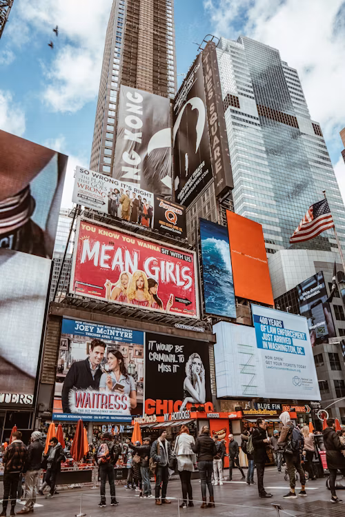
Visual design also plays a major role in attracting attention. Strong flyers use contrast, spacing, images, and text hierarchy to guide the eye naturally. Eye-catching visuals can help draw people in, but they work best when they support the message rather than distract from it. A flyer should not feel overloaded with too many fonts, colors, or competing design elements. A clean layout with one main focal point is often more effective than a crowded design that tries to say everything at once.
Attention improves even more when the message matches the audience and the placement is relevant. A flyer about a family event will attract more interest in a neighborhood setting than in a business district. A promotion for a lunch special will likely perform better near offices, retail corridors, or high-foot-traffic lunch areas. Relevance matters because attention is not created by design alone. It also comes from putting the right offer in front of the right people at the right time. This is why targeting and distribution strategy are just as important as the flyer itself.
A strong flyer should also make the next step obvious. Once attention is captured, the reader should know exactly what to do next, whether that means calling, scanning a QR code, visiting a website, attending an event, or redeeming an offer. In practical terms, flyers attract attention best when they are clear, visually organized, audience-focused, and action-driven. The most effective flyers do not just look appealing. They quickly connect with the reader and move them toward a response.
| Attention Factor | Why It Matters | What Works Best | Common Mistake |
|---|---|---|---|
| Headline | Stops the reader first | Large, clear, benefit-driven wording | Too vague or too small |
| Value proposition | Explains why the flyer matters | One clear offer or benefit | Weak or confusing message |
| Visual layout | Makes the flyer easy to scan | Balanced spacing and hierarchy | Cluttered design |
| Visuals | Support initial interest | Relevant images and contrast | Distracting graphics |
| Placement | Improves relevance and response | Right audience in the right location | Untargeted distribution |
| Call to action | Turns attention into response | Simple, visible next step | No clear action path |
- Use a strong headline: make the main message noticeable right away
- Show clear value: explain why the audience should care
- Keep the layout readable: guide the eye with spacing and structure
- Add relevant visuals: support the message without causing clutter
- Match the audience and placement: relevance improves attention
- Give one simple next step: make it easy for the reader to respond